- Have any questions?
- (Prasad) +91 96191 46851 | (Parag) +91 99878 20022
- support@pnpwebdesign.com
Mastering Responsive Design: Creating User-Centric Web Experiences

Crafting Your Online Presence: The Essentials of Online Site Design
March 31, 2024
Navigating the Digital Landscape: Finding the Best Search Engine Optimization Company in India
March 31, 2024Mastering Responsive Design: Creating User-Centric Web Experiences
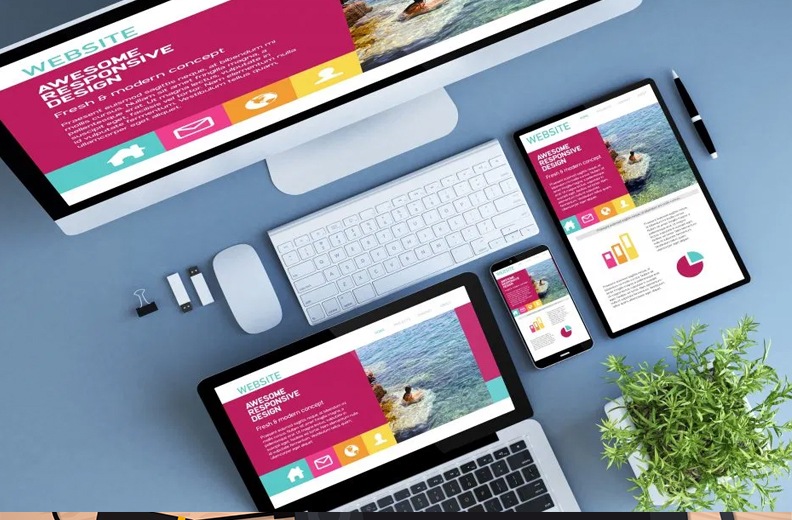
In today’s digital age, where users access websites across a multitude of devices, responsive design has become paramount for delivering seamless and user-friendly web experiences. From smartphones and tablets to laptops and desktops, users expect websites to adapt effortlessly to their screen sizes and resolutions. In this comprehensive guide, we’ll explore the intricacies of responsive design, its importance in modern web development, and practical tips for creating responsive websites that delight users across all devices.
-
Understanding Responsive Design:
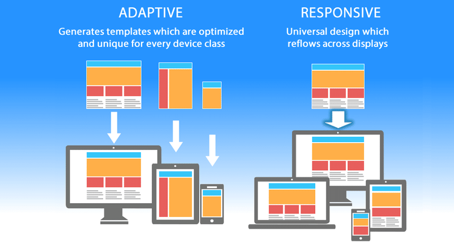
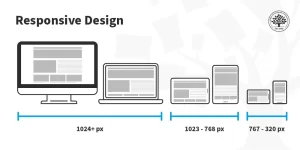
Responsive design is a design approach aimed at crafting websites that respond and adapt to the user’s device, screen size, and orientation. It ensures that websites render optimally on various devices, eliminating the need for separate mobile and desktop versions. By employing flexible grids, images, and CSS media queries, responsive design allows content to fluidly adjust to different viewport sizes, providing a consistent and intuitive user experience.
-
The Importance of Responsive Design:
a. Enhanced User Experience:

Responsive websites offer a seamless browsing experience, irrespective of the device used. By eliminating the need for horizontal scrolling or zooming, responsive design enhances usability and satisfaction for users.
b. Improved Accessibility:
Responsive design promotes accessibility by ensuring that content is accessible to all users, including those with disabilities or using assistive technologies. It adheres to web accessibility standards, such as WCAG, making websites more inclusive and user-friendly.
c. SEO Benefits:
Responsive websites are favored by search engines like Google, as they provide a single URL and HTML codebase for all devices. This improves SEO performance by consolidating website traffic and avoiding duplicate content issues associated with separate mobile sites.
d. Cost-Effectiveness:
Responsive design eliminates the need for maintaining multiple versions of a website, reducing development, maintenance, and hosting costs. It offers a scalable solution that adapts to evolving device trends without additional overhead.
-
Principles of Effective Responsive Design:
a. Mobile-First Approach:
Adopt a mobile-first approach, prioritizing the design and functionality for smaller screens. Start with the essentials and progressively enhance the layout and features for larger devices.
b. Fluid Layouts and Flexible Grids:
Use fluid layouts and flexible grids to create designs that adapt proportionally to the user’s viewport size. Avoid fixed-width layouts that may cause content to overflow or become distorted on different devices.
c. Media Queries:
Utilize CSS media queries to apply different styles based on the user’s device characteristics, such as screen width, height, and orientation. Media queries allow you to tailor the presentation of content for optimal readability and usability across devices.
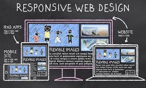
d. Image Optimization:
Optimize images for various screen resolutions and sizes by using responsive image techniques, such as srcset and sizes attributes. Serve appropriately sized images based on the user’s device to minimize bandwidth usage and improve page load times.
-
Practical Tips for Implementing Responsive Design:
a. Conduct Device Testing:
Test your website across a range of devices, browsers, and screen sizes to ensure consistent rendering and functionality.
b. Prioritize Performance:
Optimize website performance by minimizing HTTP requests, reducing file sizes, and leveraging caching techniques. Fast-loading websites enhance user experience and SEO rankings.
c. Embrace Progressive Enhancement:
Embrace progressive enhancement principles by starting with a solid foundation of core functionality and progressively enhancing the user experience for more capable devices.
d. Stay Updated:
Keep abreast of emerging web technologies, best practices, and design trends to continually refine and improve your responsive design approach.

Conclusion:
Responsive designs is no longer a luxury but a necessity in today’s digital landscape, where users expect seamless and consistent experiences across all devices. By prioritizing user needs, employing responsive designs principles, and embracing best practices, web designers and developers can create websites that adapt effortlessly to the diverse array of devices and screen sizes. As technology continues to evolve, responsive designs remains a cornerstone of modern web development, empowering businesses to engage and delight users on any device they choose.


